Minecraft Addons
A Minecraft companion app redesigned to feel like part of the game, with more to explore inside.
- Role
- Sole designer
- Industry
- Gaming
- Scope
- UX Design, UI Design, App Redesign
- Tools
- Figma, Illustrator
- Year
- 2025
Overview
Minecraft Addons is a companion app for Minecraft players, but it didn’t look like one.
The original app felt outdated and had no clear connection to the Minecraft world, so it was hard to recognize at first glance.
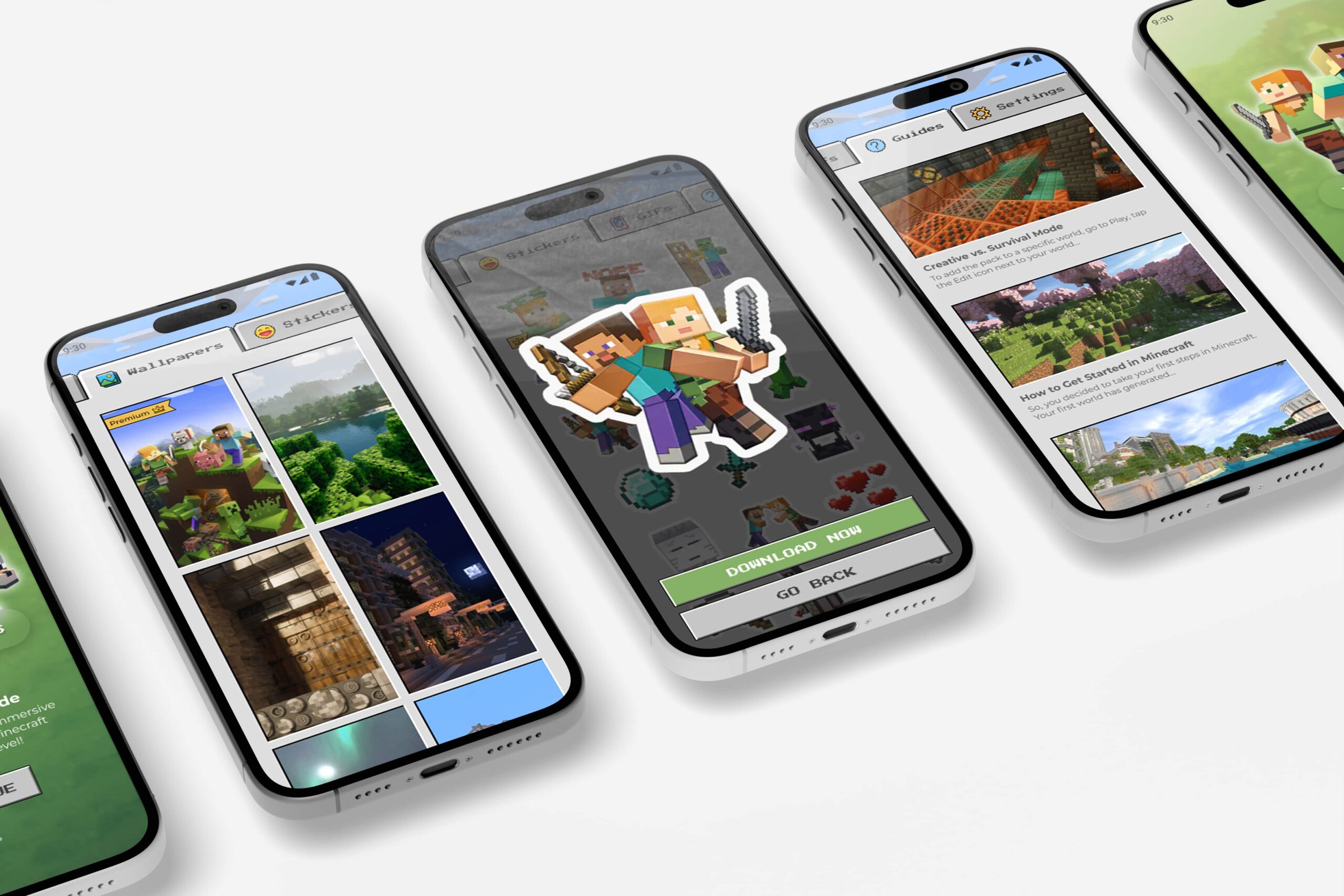
I redesigned it with a playful, game-inspired look that feels instantly familiar to players, and grew it beyond 3D textures and guides with new wallpapers, stickers and GIFs.
I was the sole designer.
The Challenge
Look like Minecraft, without turning into a mess.
The challenge had two parts:
- 01
Identity
The app had to read as Minecraft from the very first screen.
- 02
Structure
New types of content had to fit in without making the app crowded or confusing.
Research & Discovery
I compared the old app with the game it was made for, and the gaps were clear:
- 01
Nothing said Minecraft
The interface could have belonged to any app, so players had no cue it was made for them.
- 02
No room to grow
Textures and guides were there, but the structure wasn’t ready for new formats.
- 03
Players expect fun
A game companion that feels like a settings menu misses the point.
Players should recognize the app before they read a single word.
The Solution
- 01
Familiar from the first screen
Minecraft-inspired visuals that players recognize right away.
- 02
Simple, well-defined sections
Content is reorganized so the new formats fit in without clutter.
- 03
Playful, but clear
A game-like style on a clear layout and hierarchy: easy to understand, and still fun to explore.
The Result
An app that finally looks like it belongs to the game it’s built for.
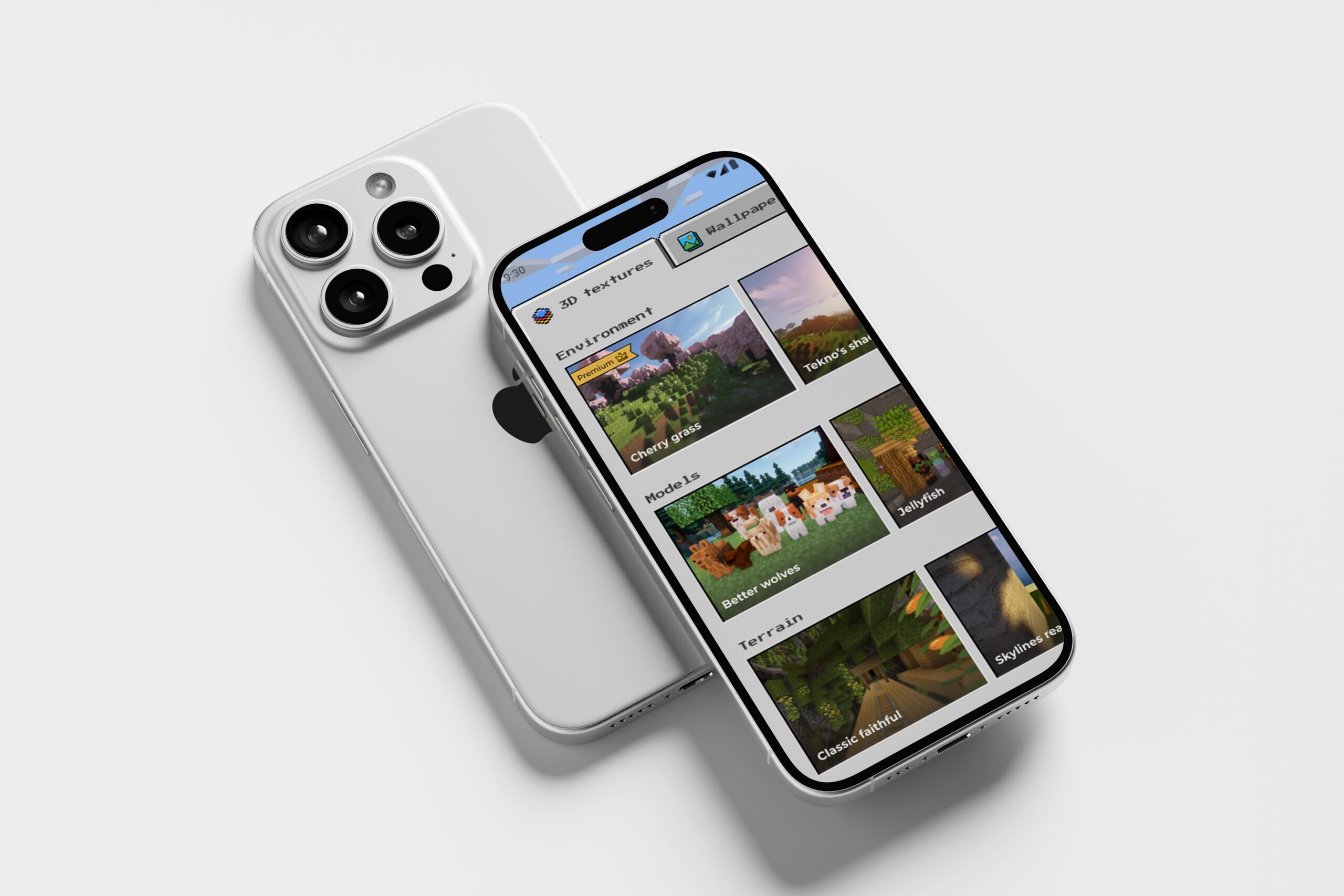
Players can tell what it is at a glance. Wallpapers, stickers and GIFs sit in clear sections next to the textures and guides, so there’s more to explore without more to figure out.
What I Took From It
Playful and clear aren’t opposites.
A strong theme can carry a lot of personality, as long as the structure underneath stays simple. The fun lives in the visuals; the clarity lives in the layout.