Poster Maker App
Focused improvements to a poster app:
new onboarding, a rethought creation flow and features that finally feel simple.
- Role
- Sole designer
- Industry
- Creative Tools
- Scope
- UX Design, UI Design, Feature Design
- Tools
- Figma, Illustrator
- Year
- 2025
Overview
Poster Maker is an app for designing posters on your phone, and some of its simplest features didn’t feel simple.
Unlike my other projects, this wasn’t a full redesign but a focused improvement: new screens and features that stay true to the app’s original visual language.
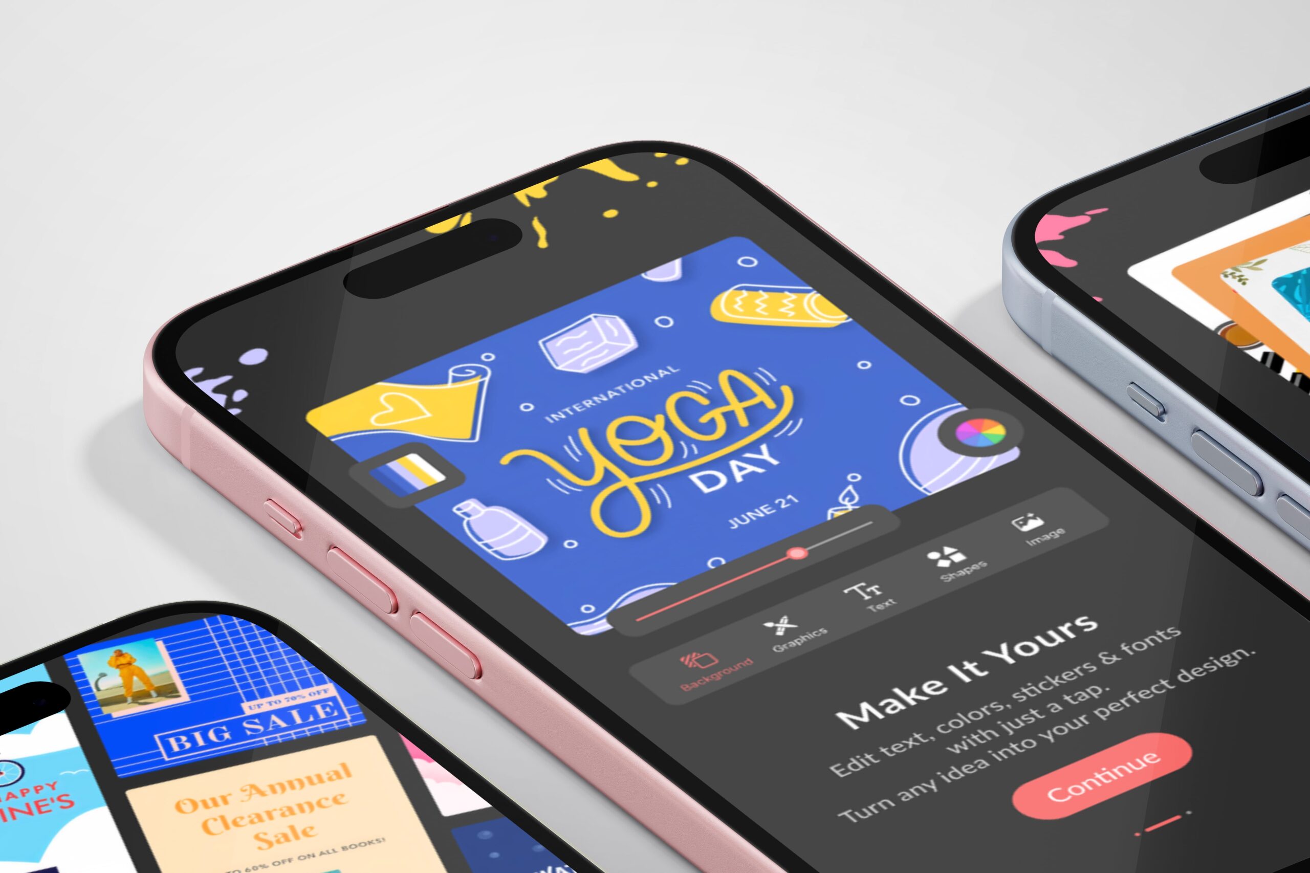
I designed a new onboarding flow, reworked the whole poster creation process and fixed several features that were meant to be easy but felt unclear.
I was the sole designer.
The Challenge
Fix what feels confusing, without making the app feel unfamiliar.
The challenge had two parts:
- 01
Familiarity
Existing users had to keep feeling at home, even as the creation flow changed completely.
- 02
Restraint
Every new screen and feature had to make the app easier, not heavier.
Research & Discovery
I went through the existing app feature by feature, looking for the moments where people would get stuck.
The pattern was consistent: the problems weren’t in what the app could do, but in how it asked people to do it. Features that should have felt effortless felt unclear.
The app didn’t need more power. It needed less friction.
The Solution
- 01
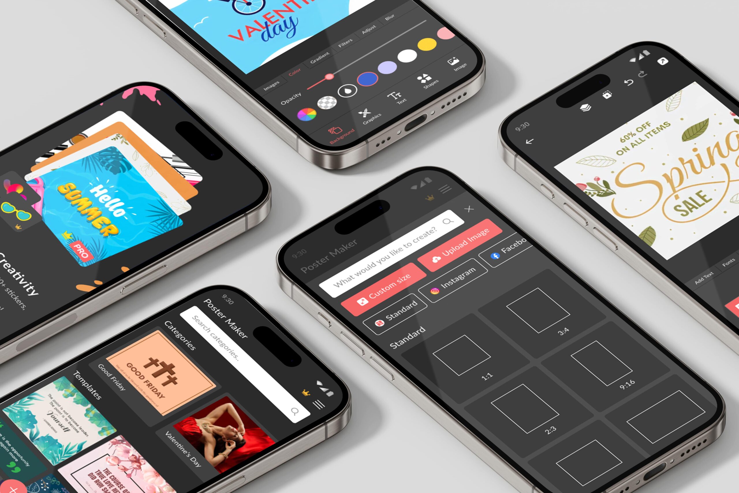
A smoother creation flow
Key interactions are simplified and friction is removed from the poster creation process.
- 02
A proper welcome
A new onboarding flow introduces the app before people start creating.
- 03
New screens with a clear job
Each new screen and feature has a clear purpose and fits smoothly into the existing experience.
- 04
Easier, still familiar
The app became more intuitive while staying familiar to returning users.
The Result
An app that delivers what its name promises: easy poster making.
Creating a poster feels smoother and more intuitive, new users get a proper introduction, and returning users still feel at home.
What I Took From It
Not every project needs a blank page.
Improving an app people already use means respecting what they’ve learned. The work was in finding the friction and removing it, while leaving the familiar parts exactly where people expect them.