Gallery App
A photo app redesigned end to end:
more tools, yet simpler to use than before.
- Role
- Sole designer, end to end
- Industry
- Media
- Scope
- UX Research, UI Design, App Redesign
- Tools
- Figma, Photoshop
- Year
- 2025
Overview
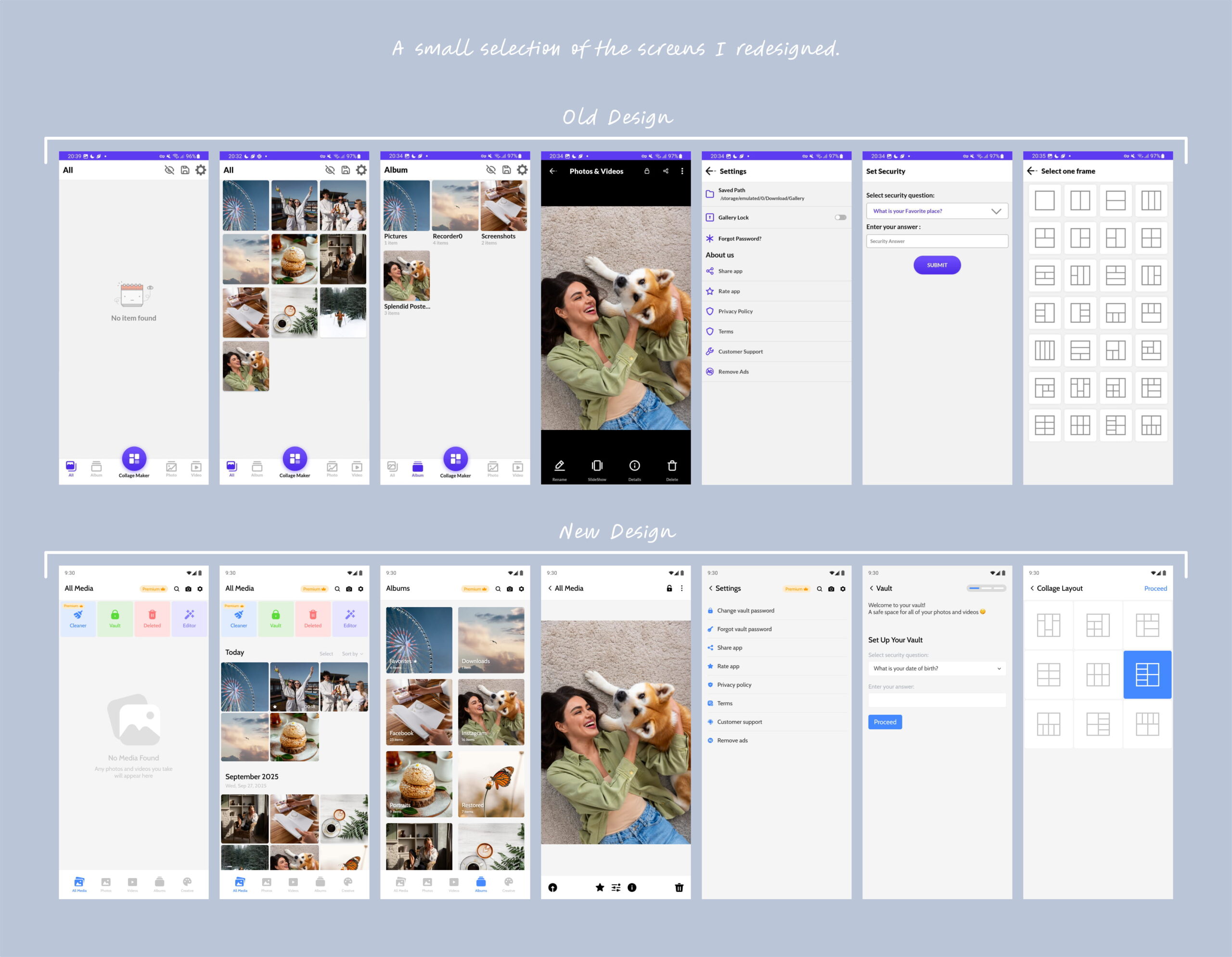
Gallery is a photo app that had fallen behind: a dated look and a thin feature set that no longer matched the client’s vision or what people expect today.
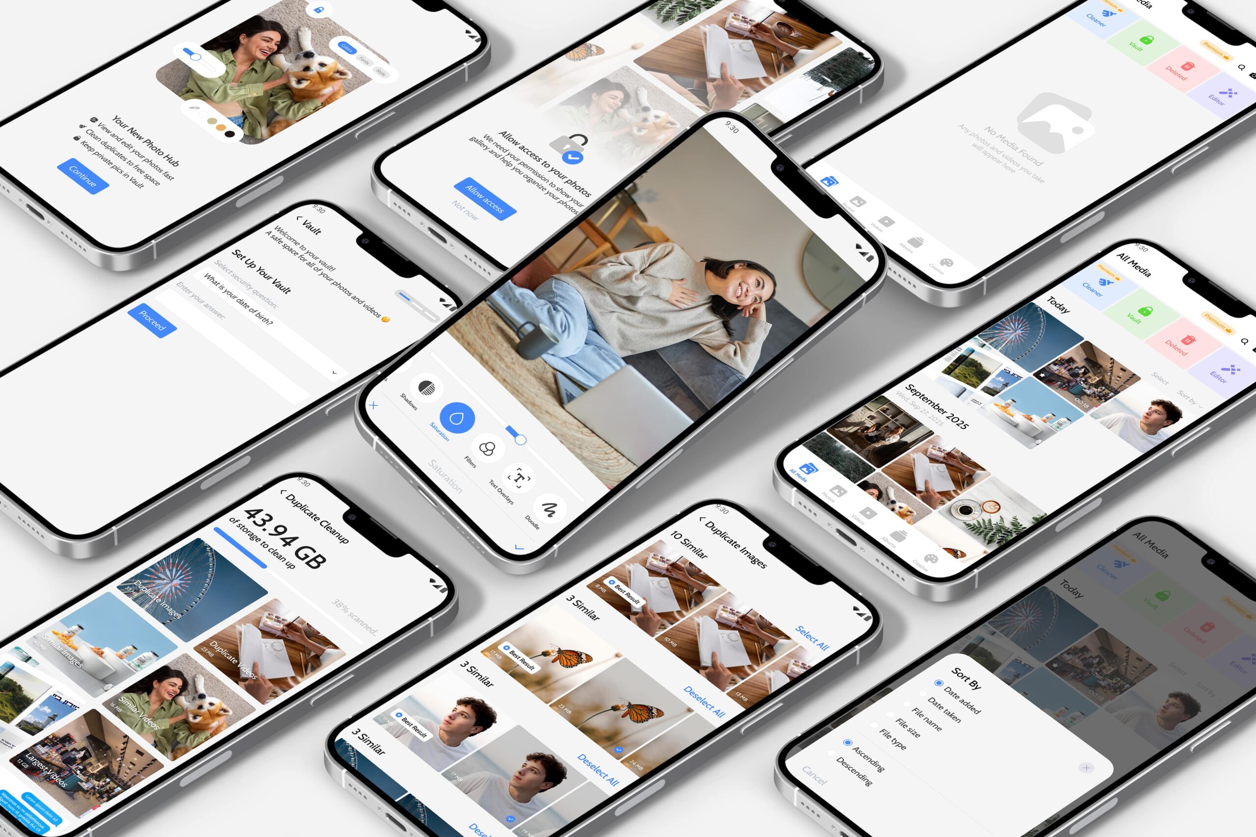
I redesigned it end to end: a fresh interface plus new tools, including a duplicate cleaner, fuller editing, onboarding and permission screens, a recently deleted folder, dark mode and landscape support.
I was the sole designer, from start to finish.
The Challenge
More features usually means more clutter.
Building a duplicate cleaner or editing tools wasn’t the hard part. Adding all of them without turning a simple app into a confusing one was.
The old interface didn’t help: dated and loosely structured, with no clear home for anything new.
Research & Discovery
I mapped the new features against what people expect from a modern gallery app: clearing duplicates, quick edits, a safety net for deleted photos and dark mode.
The value wasn’t in more features, but in making each one feel obvious.
The Solution
- 01
A clear place for every feature
The app stays easy to scan, even with more inside it.
- 02
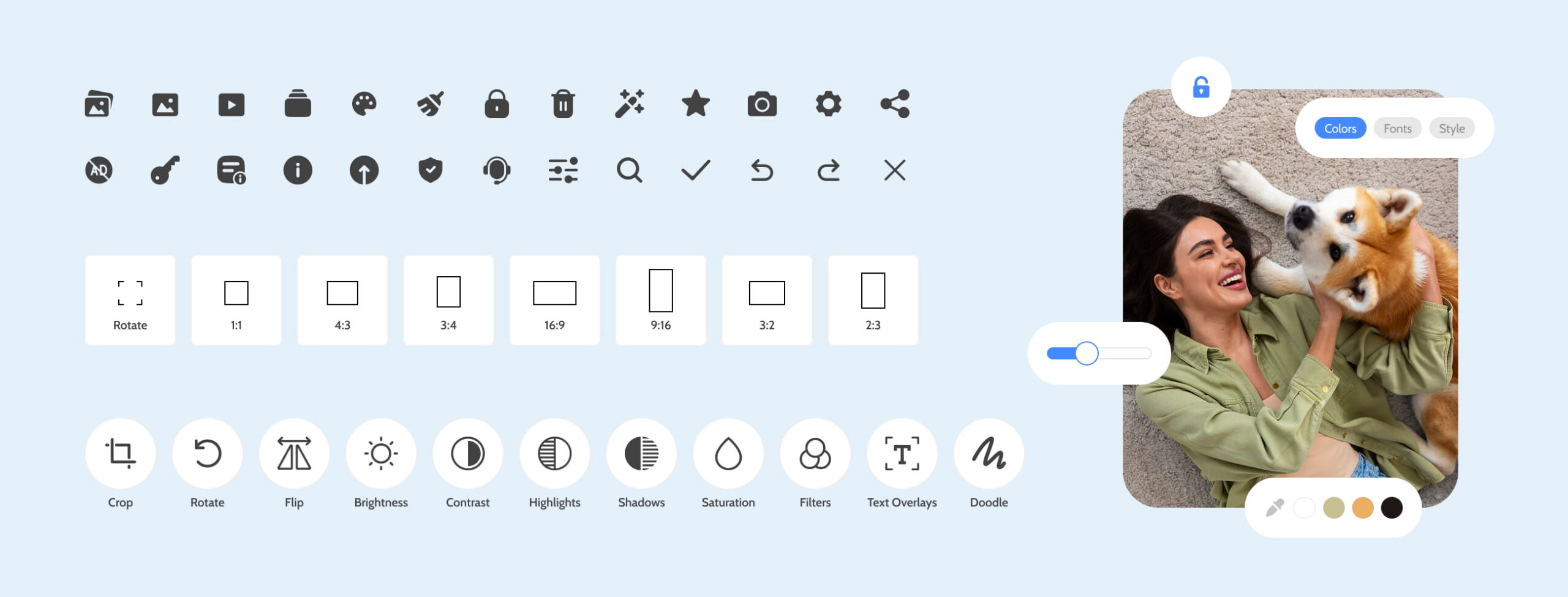
A modern, consistent visual style
Consistency does much of the navigation work on its own.
- 03
Guided steps for heavier actions
Duplicate cleaning and photo editing are broken into clear steps, so they feel controlled instead of overwhelming.
The Result
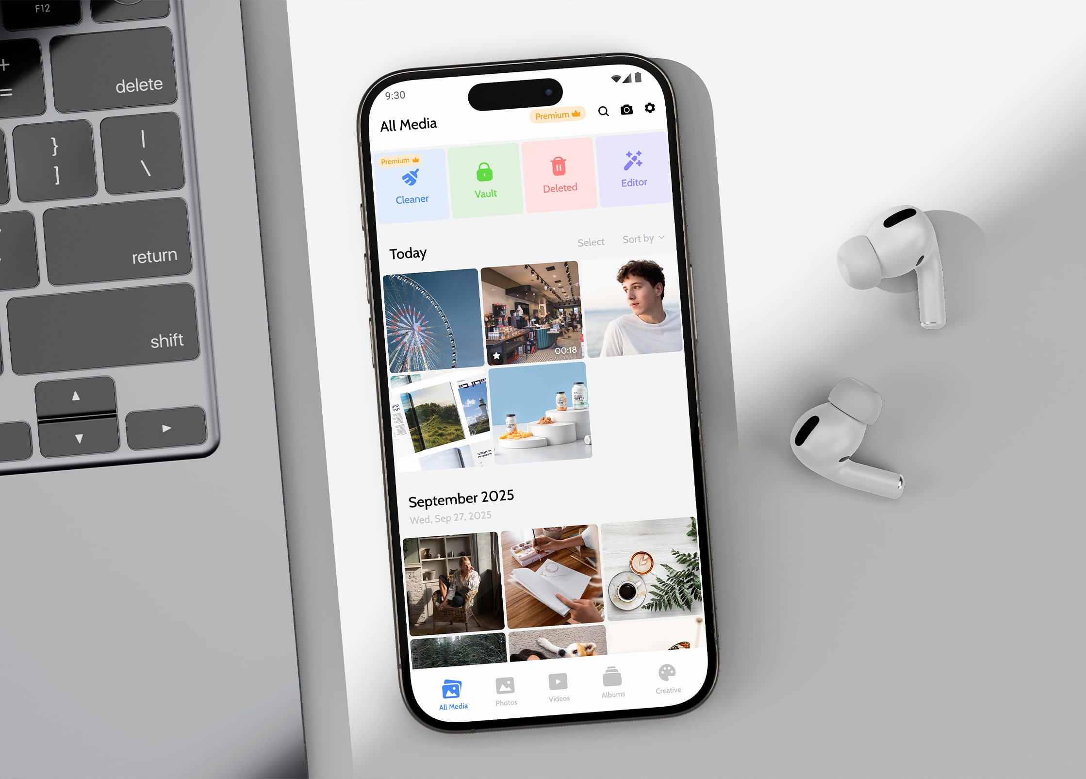
A photo app that does noticeably more, yet feels simpler to use than before.
The new tools sit naturally in a clean, modern interface. It feels more capable without feeling crowded, and stays easy to navigate whether you’re clearing duplicates or just browsing photos.
What I Took From It
The real skill wasn’t adding features. It was hiding their complexity.
Anyone can pile more tools into an app; the hard part is keeping it effortless afterward. Growing an app while keeping it simple comes down to giving every new feature a clear, obvious place to belong, so it feels fuller, never heavier.